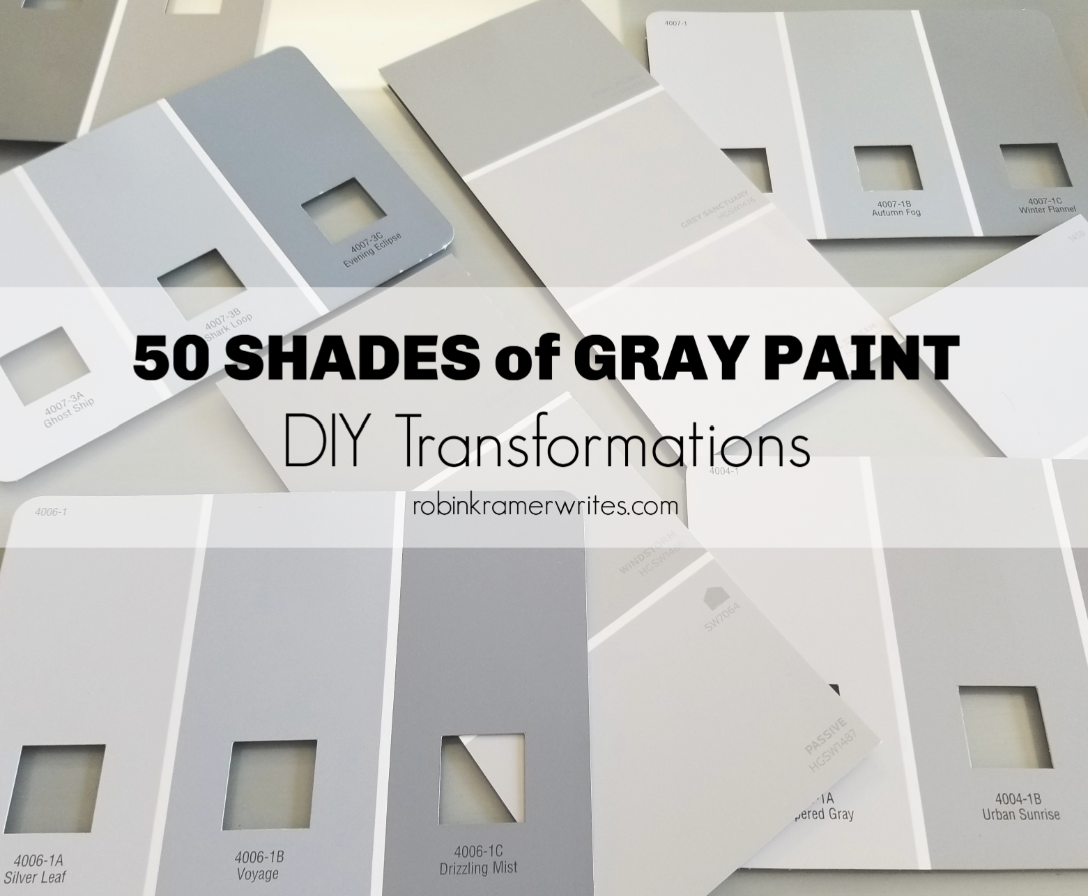
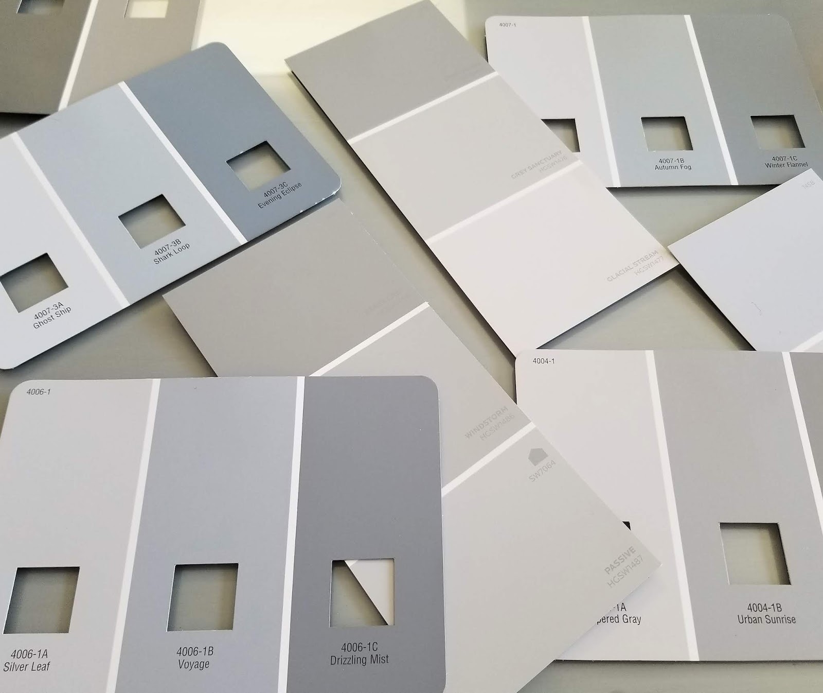
I've heard that the human eye can discern over a million colors. This sounds impressive until you have to pick paint chips. Then your miraculous ocular capabilities disintegrate into tedious conversations with your spouse about whether Stone Eagle, Autumn Fog, Glacial Stream, Windstorm, Ghost Ship, or Winter Flannel has the right undertones to avoid looking "overly blue" or "too muted and taupe-y" in your family room.
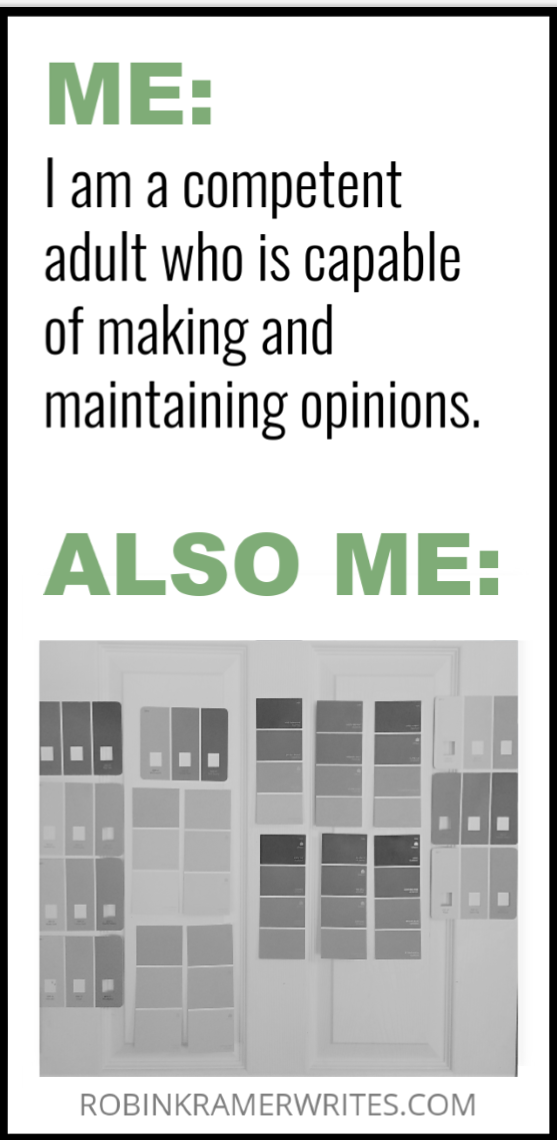
My paint selection process always unfolds in a consistent fashion. After viewing multiple samples in various lighting, deliberating for several days, and wondering who gets to name paint colors and how I can have their job, I normally settle on a color. But herein lies the rub: I never entirely know how paint will look until it's painted.
Let's face it:
The good news is that it's just paint. After years of DIY work, I've accepted that I can always repaint if a shade goes wrong. It's not permanent. Inconvenient and disappointing perhaps, but never permanent.
That being said, one permanent addition to my home has been the color gray. I love gray. It can be soothing and cozy. It can be crisp and fresh. It's a wonderfully versatile neutral, and today I want to take you on a house tour to share my favorite gray DIY transformations. Let's start in the most logical location: the front door.
Front Door. After living in my house for nearly 13 years, I noticed that my interior front door blended into the white trim and nearby walls. The next week I made it a priority to rectify this. (If a project takes roughly a dozen years for you to notice, you might as well tackle it quickly once you do.)
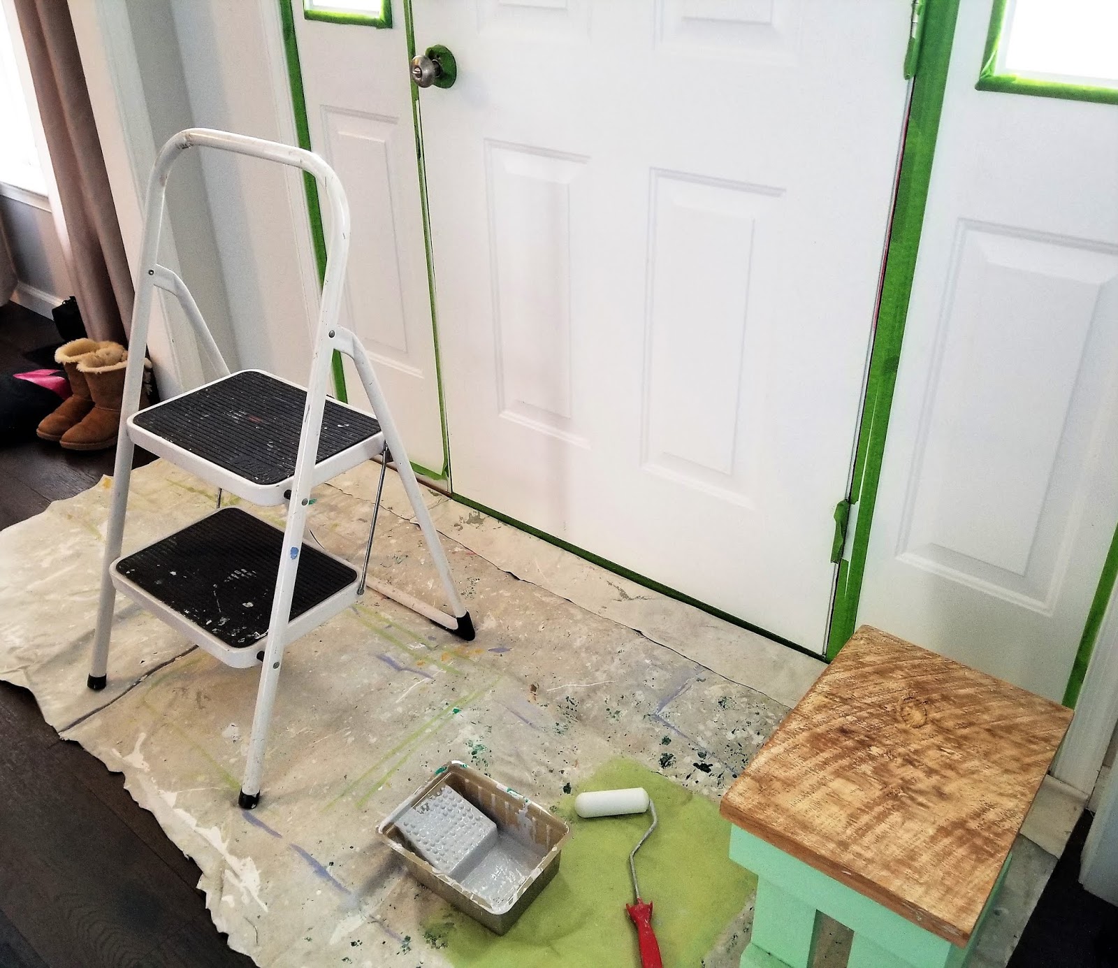
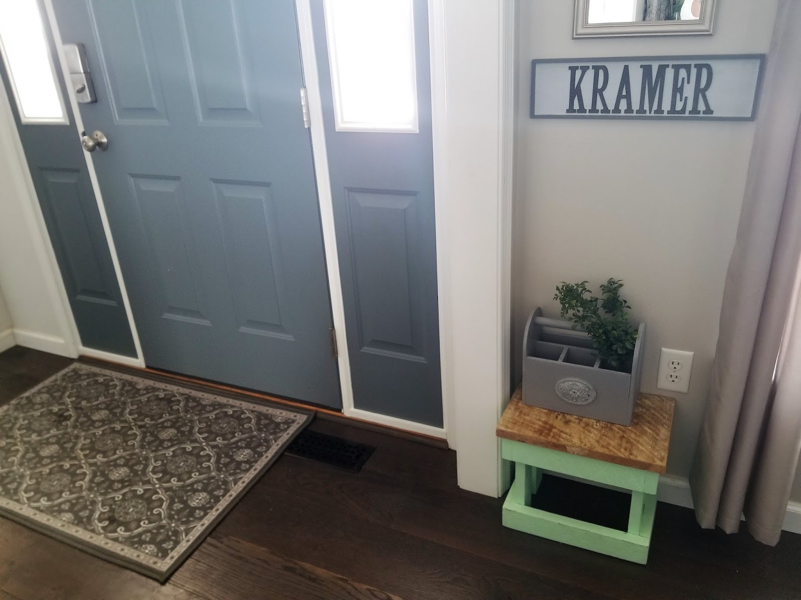
I chose Iron Frost from Valspar, a cool iron-toned gray that compliments our floors and contrasts nicely with our white trim. Painting an interior door is simple, yet it provides instant improvement. Now that our door pops against its background rather than blends into it, our entryway feels more definitively entryway-ish, which always is a good attribute for an entryway.
Kitchen Bench. If you want your home to look cohesive, aim to carry a similar color scheme from room to room. Our kitchen table is positioned directly down the hallway from our front door, so I used the same Valspar Iron Frost on the kitchen bench. Without overpowering, the repetition continuity from our entryway to the back of the house.


Before painting, I prepped by cleaning and lightly sanding the cabinet, removing hardware, and applying painter's tape to protect each glass panel. (Never skip these preliminary steps. Time prepping is never time wasted; the result is always a better final product.)

My favorite touch was upgrading the plain glass doors with a mirror-like finish by applying Krylon Looking Glass Spray Paint in silver. It not only adds an attractive shine that glams up the otherwise simple cabinet, but it also obscures the contents inside.


My favorite touch was upgrading the plain glass doors with a mirror-like finish by applying Krylon Looking Glass Spray Paint in silver. It not only adds an attractive shine that glams up the otherwise simple cabinet, but it also obscures the contents inside.
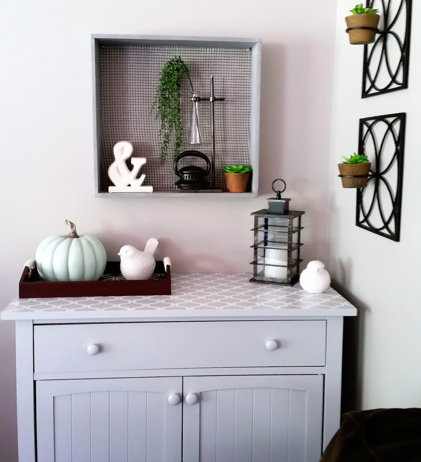
Wooden Mail Sorter. I love visiting garage sales, finding unloved cast-off objects, and transforming them into fresh and memorable pieces. This past summer at one such garage sale, I met Jessica Dolan, the owner of Room to Breathe, a local home organizing and staging business. (What an important job to help people manage their belongings rather than having their belongings manage them. I love this!)
At the end of our conversation, Jessica gifted me this wooden mail sorter. I promised her that I'd turn it into something beautiful and functional.

After filling holes with wood putty and sanding the piece, my youngest daughter got into the DIY action and helped me to paint two coats of a stone-hued gray called Mission Control by Behr. (Train them young, I say. Child labor laws don't apply to this scenario.)

Once the paint was dry I added a light layer of Amy Howard's Liming Wax to achieve a slightly weathered look. As a finishing touch, I affixed label holders from Michaels onto each individual compartment.

The piece now proudly hangs above my newly refinished Target cabinet, balancing the space, complimenting the colors, and showing that even the simplest project can add charm and character.

Wooden Cubby. I don't have a "before" picture of this wooden cubby, but if you were alive in the 90's, you might recall a certain popular decorating trend that, inexplicably, featured country geese against mauve and dusty blue backgrounds. This cubby must have been made during this ill-advised era because it was painted with a gaggle of geese happily wearing ribbons around their slender geese necks.
Geese aside, the cubby itself was sturdy, nicely shaped, and just one dollar. (Another great garage sale find!) Painting it with two coats of Behr's Anonymous, a subtly warm-undertoned gray, modernized it immediately. For a final touch, I added a decorative embellishment that I found in a Micheals clearance bin, which brings extra dimension and visual interest.

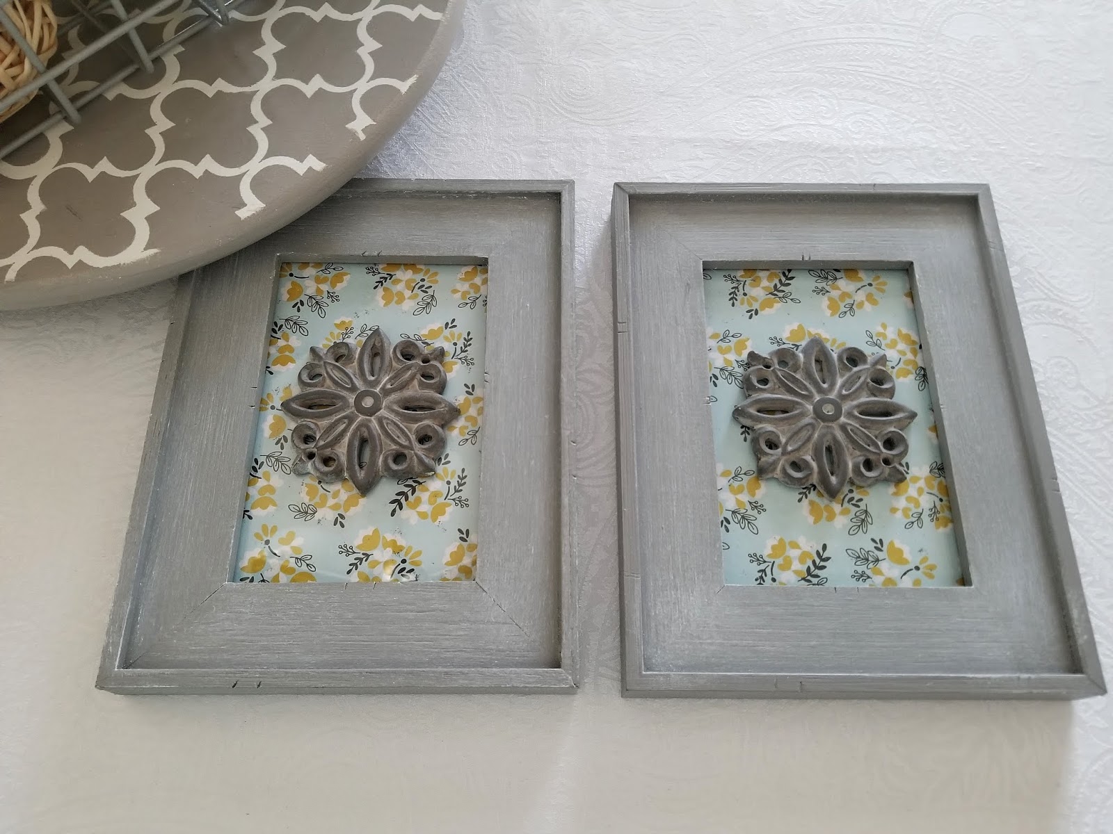
Picture Frames. These three picture frames, which originally were green, were gifted to me on a Facebook Buy Nothing group. If you want to create simple and inexpensive DIY wall art, just frame scrapbook paper. Using Anonymous by Behr once again, I painted the frames, weathered them with a coating of Amy Howard's Liming Wax, and then added two embellishments (Michaels clearance bins for the win again!) to the outer frames.

One added bonus about framing scrapbook paper: you always can swap different paper for an entirely new look. The sunset chevron pattern (above) works nicely in our bathroom, which is painted a neutral taupe. If I want a cooler-toned look for the frames, I can just use another patterned paper.
Laundry Room Sign. Oh, laundry room, I'm grateful for you. Like all families with kids, we do a lot of laundry, and I thought it would be fitting to commemorate the work-horse of a room that makes it all happen. I first bought a wall plaque from Michaels using a 50% off coupon.

Then I picked up some inexpensive wooden letters, double-checking my mental spelling of L-A-U-N-D-R-Y a half dozen times because (try as I might) the longer I think about the spelling of a word, the less certain I am that it's actually a word.
The only glitch was that Michaels had no "L's," so I did what any self-respecting DIY-er would do: I bought an "F," flipped it upside down, and cut off the extra extension. Boom.

I used a slightly darker tone of gray paint for the trim (Anonymous by Behr), a lighter gray for the background (Gravity by Valspar), and spray-painted the wooden letters with Rust-Oleum's Oil-Rubbed Bronze. (I love to spray paint. I will spray paint anything that doesn't move.)

I liked this laundry room sign so much that I created a second one to showcase our last name. (You'll see it in the picture of our front door posted above!)
Another Cabinet from Target. If you've been reading my blog for long, you might remember a piece that I upgraded a few years ago. We bought this cabinet from Target shortly after we got married, and I wanted to update its original natural wood. Two coats a calming dove-gray (Gravity by Valspar) freshened the piece, and I stenciled the top with a lattice pattern in a subtly contrasting white.
If you like this look, check out my original W.W.J.D. (What Would Joanna Do?) Farmhouse-Style Decorative Shelf post to see more!
Mid-Century Modern Cabinet. I often tackle DIY projects rapidly, but this particular piece -- a handmade midcentury-style cabinet that I purchased for only $1.50 at yet another garage sale -- sat in my garage for nearly three years before I began the transformation.

I admired the piece's character, especially given the homemade label adhered to its back indicating the carpenter, date, and original finish.

This piece required some work: chipping off the music notes that had been affixed to the doors (it originally held record albums), filling cracks in the top veneer, and priming carefully with a sealer to stave off a slight musty smell. After receiving a collection of paint samples from my local Facebook "Buy Nothing" group, I painted swaths of each on the back of the cabinet to test colors.

I settled on Iron Mountain by Behr, a color that provides satisfactory depth without any blue undertones that might look too cool. We now use the cabinet to store office supplies and printer paper next to our computer desk.

Look for what could be, not just what it is. Every DIY project starts when someone imagines something different from what it originally is. This can be as simple as changing a color or as complex as repurposing objects and redesigning floor plans. Just don't take items at face value; DIY thrives when you see "what could be."
Sample first. Samples aren't expensive -- just a few dollars -- but they're much more useful than two-inch paint chips. (Plus, they're the perfect size to complete small projects.)
Don't skip the prep work. You always make up in end-of-project quality what you invest in before-project prep work.
Carry similar color schemes through multiple rooms. Not only does this make your home look cohesive, but you'll also make the most of the paint you purchase.
Remember that it's just paint. Your home is where life happens. Enjoy the process of beautifying it. Take your time. The pictures in this post capture a few years of my projects, done bit by bit, one weekend at a time. (After all, the best part of home isn't the paint color; it's the people who share home with you.)
Now, go forth and paint on!
Thanks for visiting today. Whether you're new or a regular reader, consider joining my email list so new posts will be sent directly to your inbox, like small gifts delivered electronically JUST FOR YOU! (If you're reading on a desktop, visit the "Subscribe by Email" box in the right toolbar. If you're on a mobile device, simply scroll down.)
And while we're at it, if you're new here, let me invite you to follow on Facebook or Pinterest. Join the fun at Robin Kramer Writes!


Hi Professor Kramer!
ReplyDeleteI have to say, this post was honestly one of the most fun posts I have ever read. I love interior design, it is one of my absolute favorite things to do or look at in my free time, so naturally, the aesthetic of this post immediately drew me in. I also LOVE how you made your "L" in the laundry sign by making do with an altered "F," so creative! Your tips that you summed up for all of us at the end of your post were so fun to read, and I love the idea of taking similar color schemes to each room to create a more cohesive look. I love reading about all of the DIY work you have done around your home, it is truly inspiring. Thank you for sharing, this post was extremely enjoyable to read, and the pictures of real-life examples of your work were an amazing addition!
You're so sweet, Hannah! Glad that you liked the before and afters. pictures. (That hackneyed "L" was one of my favorite details, by the way!) ;)
Delete